The State of Slayer, Part 4: Rooted in Design
Chris
Jun 06, 2016
This is part 4 in our blog series, The State of Slayer. Learn about the origins of our company and the impetus for our radical products in Part 1: Provoking Innovation.
When it comes to taste, is it really all about palate? Now more than ever, perhaps, culinary professionals and gastronauts recognize that experiencing your food doesn’t start with the first bite – we “eat with our eyes”, they say. Drinking coffee is very much the same.
Actually, customers’ overall impressions of coffee shops are already forming before they’ve tasted their drink, or even placed an order. The very space itself is implicitly tied to their experience: light, furniture, equipment, branding.
In the early 2000s, when Slayer existed only in the imagination of our founder, Jason, coffee shops were trending toward a renewed focus on design. As the quality of their coffees climbed, business owners wanted to build cafes that suggested quality in their own right. They were off to a great start… but then it came to the espresso machine. The centerpiece of every coffee shop was a boxy appliance built with sheet metal and plastic. It had been this way, without much change, for decades.
The implications weren’t always accurate, of course, but could every customer tell the difference? We may want to believe that only taste matters but, in reality, the visual experience often carries as much weight as hospitality, hygiene, or any other tenet of good business.
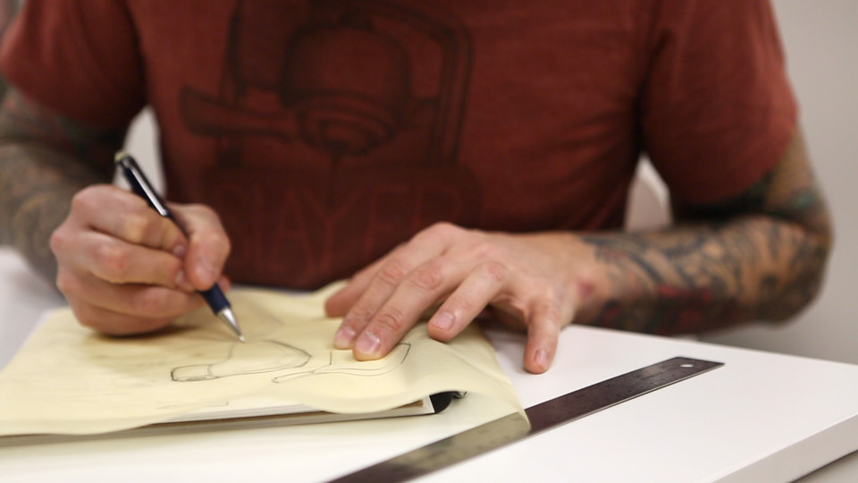
When we began to develop the machine that would come to be known as “Slayer”, we intended to set a new precedent for design. The striking aesthetic that you see now is the inspired brainchild of our Industrial Designer, a core team member to this day.
Meet Chris Flechtner.

Chris’ career began at the Massachusetts College of Art and Design, where he declared as a Graphic Design major. Studying jewelry-making and metalsmithing on the side, he found himself unexpectedly impelled to change tracks. He was invigorated by the chance to work with his hands and he switched to MassArt’s Fine Metalsmithing program.
But don’t start to think of Chris as a “usual suspect”. Before Slayer, his history with coffee included only one project, a grinder. There was no barista experience, no family lineage, nor anything else to suggest a bright future in designing espresso machines. To Jason, in fact, part of the appeal was that Chris came with fresh eyes.
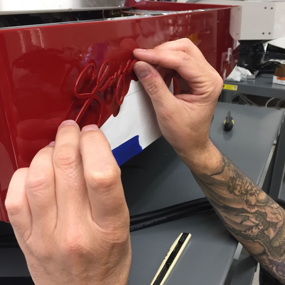
What inspired him? In college, Chris wandered the halls at Boston’s Museum of Fine Arts on a weekly basis. He was continually drawn to the Asian art wing, where he marveled at the fine craftsmanship of Japanese samurai swords. (If you ever meet him, ask about his tattoos – they’re all taken from the exhibit.) This fascination led him to an apprenticeship with a local bladesmith, building and restoring swords.
His work broadened, over the years, as he graduated from MassArt and completed a Master’s program at Cranbrook. He designed furniture, light fixtures, and motorcycles, developing a highly utilitarian style that was balanced by a commitment to add beauty to the world.
At Slayer, this would mean designing a machine that acted as both a practical tool and an elegant centerpiece. Chris joined our core team in 2007 to make Jason’s vision a beautiful reality.
An important note about his role: Chris is an industrial designer, the distinction lying not in aesthetic, but process. A ceramic artist designs as she makes, the form of her vase being determined at the time of its creation. Inherent to this process, her work is one of a kind and not easily duplicated.
But industrial design has the unique goal of mass production. Chris faced the challenge of creating designs that were practical and replicable, built with consistency for each of the hundreds – then thousands – of machines that we would produce by hand.
There was an irony here, being that we had no concern for cost. We were committed to doing what was best, regardless of price, in order to make a machine that we could stand behind one-hundred percent. Without this sort of restriction, Chris enjoyed great freedom to select materials.
Our final instructions? Ignore what espresso machines should look like. With Chris’ fresh eyes and Jason’s rebellious spirit, we set off to create something remarkable.

Even early on, the Slayer brand had assumed an undisguised intensity. We envisioned a powerful appearance: heavy, yet sleek, and obviously American. On various components, Chris aimed to create contrast with 3 distinct metal finishes – mirror-polished, machined, and sand-cast – and in this regard his years of metalsmithing experience proved invaluable. Knowing how to produce the finishes himself, he found them easy to incorporate into the Slayer aesthetic. The polished group cap, oozing sexiness, remains one of his favorite features.
Ever-inspired by his days at the museum, Chris let the Japanese aesthetic of wabi-sabi inform his palette of materials. This train of thought, which prizes beauty in transience and imperfection, led him to select natural wood for portafilters and actuators, as well as sand-casting for Xs. Each piece made with these materials and processes displays eccentricities that make it truly unique. In the case of wood, time only adds to its beauty, as the handles show subtle wear.
Extraordinary effort was poured into every aspect of the user interface. We considered the everyday devices that people use and asked, “What feels good?” The brew actuators, we thought, should have the same heft and fluidity as a metal radio dial. Baristas should prize each handle in the same way that chefs prize their knives. With these controls, we resurrected the craft of coffee by designing theatrical movements that tell the customer, “Look, I’m making this for you.”
If you pay attention, Chris’ influence is unmistakeable in this interface. As an apprentice bladesmith in Boston, Chris made his first knife handle with cutlery rivets, the same type of brass pins that decorate Slayer’s brew actuators. The portafilters and steam handles, requiring a slimmer design, were inspired by the stiletto dagger – a knife known for having a handle without rivets.
Slayer features numerous design elements that may not see much acclaim, or may even go unnoticed, but are absolutely intentional. Next time you see one of our machines, look at the profile of the brew actuator; it’s a scaled-down reflection of the rear body panel. Look at the angle of the curves on every rounded part; it’s the same radius. Chris lives in these details, truly believing that a little can go a very long way.
The result is an iconic design, so powerful that you recognize it without any branding. Through Slayer, Chris endeavors to give freedom and inspiration to other industrial designers, saying, “Look what you can do.” Espresso machines have come a long way, but perhaps there’s always further to go.
What’s next for Chris, then? Going on 10 years since he signed on to the Slayer project, he’s still asking questions. “How can we address the fickleness of wood,” he’s wondered. “What has all the soul without the liability?” And, “Where can we hide wires and hoses, to put them out of customers’ view?” His imagination runs wild with answers and, in typical fashion, they’re beautiful.
More on that in part 5.
Want to know more?
Big news from Slayer in part 5, coming soon.
Slayer Corporate Headquarters
PHONE: +1 206.284.7171
707 Lind Ave SW, Renton, WA 98057